

Kitchen Cabinet Paint Color Reveal {Before & After}
This post may contain affiliate and/or sponsored links for your shopping convenience. As always, all opinions are my own. Thank you for supporting brands that support House Full of Summer!

In my last post, I went through all of the updates we made to our kitchen since we bought our home. Although the new countertops, modern backsplash and lighter flooring really opened up the space, there was one more thing on my list that would completely change the look of our kitchen: Paint!
This is one potential DIY that I was not willing to do myself. I’m not that great at painting and I wanted our cabinets to have a more custom look. So, I called Jennifer of The Burlap Nest and had her come over to see what she was working with in person. I trusted that she would be able to give them the polished, smooth finish I was looking for because she actually painted the kitchen cabinets at our last home about 5 years ago.

Even though I had a lot of “inspo” pics saved on Instagram and Pinterest, it still was tough to decide on the right color for the cabinets. Usually, the easiest way to find the right answer is to weed out all of the “wrong” answers. In this case, white was the wrong answer for my kitchen; not only because I’ve been there and done that and wanted to try something different, but also because of the warmer tone of my kitchen countertops. (You can see how I chose the backsplash and countertops in greater detail in my last post.)

I have to admit that when they were first installed, I felt like I had made the wrong choice. I wanted a cooler tone and it threw off my whole kitchen design plan. However, I absolutely love how my “plan B” turned out.
Also, I believe that white is always going to be a kitchen classic, but putty, coffee and mushroom toned cabinets is a trend that I think is here to stay for quite a while. Here are a few of the spaces that inspired me as I searched for kitchen ideas and paint colors:

Studio McGee

Studio McGee

Jenna Sue Design

Heidi Callier Design
Are you seeing where I’m going with this? Here’s a quick tip if you’re trying to make some design decisions but don’t know where to start or don’t know what you like: Create a new board on Pinterest and pin only your favorite photos - the ones that really inspire you. After a few days of doing this, go back to your board and look for similarities within the images you’ve pinned. That’s probably the direction your heart wants to go. ;) Those warm tones are so beautiful, aren’t they? Do you see something else that every space has in common, besides the warm cabinet color? The countertops are all a very cool white/gray marble or marble look and that makes the cabinets look a bit warmer than they actually are. So, what did this mean for me and my kitchen? Well, since my countertops are much warmer, they end up making a greige color look too gray rather than beige. Even though I was aware of what to look out for, I still decided on the wrong color after testing out a few samples!
Studio McGee is one of my favorite designers and they had used Swiss Coffee by Benjamin Moore in one of the kitchens I shared above, so it was one of the three paint samples I took home on my first trip to the paint store. It actually looked so light yellow in comparison with my beige counter base that I knew instantly it wasn’t going to work.

The other two samples I got were Feather Down and Balboa Mist at half tint. I was tricked by the taupe look of Balboa Mist. It seemed to match the veining in my quartz so well, that I thought it was a shoe-in. I did think the half tint sample was too light, so I just went with the full strength Balboa Mist. Here it is in the can:

Jennifer and her friend, Sybil, arrived ready to paint the morning after I decided on a color. We all agreed the paint looked a creamy mushroom color in the can. I even shared it on my Instagram stories and then posed the question “What color does this look like to you?” Many people responded with peach or beige or some other variation of a warm tone. NOBODY thought it would look GRAY. But it was indeed gray looking on my cabinets - and a gray that was much too light at that. Can you believe this is the same color?


I held a beige pillow up to it so you can really tell the difference. The cabinets match the gray/taupe coral on the pillow - not the beige fabric!

I felt terrible about it, but I had to change the color. Luckily, we were only down one coat of paint and the only waste was in buying the wrong paint color. Jennifer applies three coats of paint, so the next two would hide the previous paint anyway. I let her know it was just not at all what I was imagining in my head and ran back to the paint store first thing the next morning! I explained what had happened to the paint specialist and we pulled out a few more colors to sample. In order to match the color I wanted, I brought along my throw blanket that had both beige, gray and taupe stripes. It was easier to narrow in on the right shade of beige by matching the paint chips to the beige stripes in the store lighting.


Once I got my new samples home, I painted the white construction board I picked up at Target and hung them all around my kitchen, snapping photos of the samples from different angles with my phone and camera as I moved them from place to place.

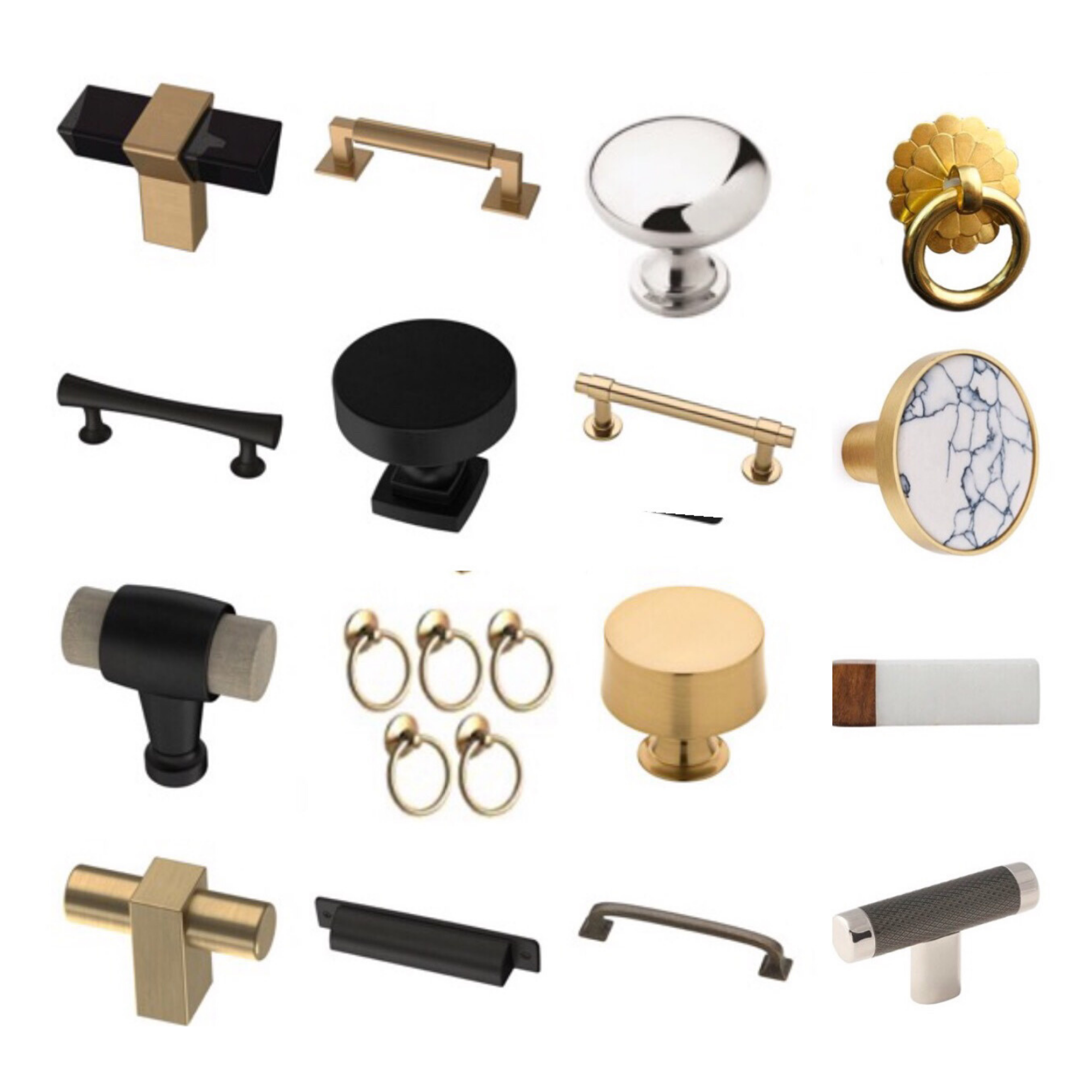
The gold crane figurine is to show what brass/gold hardware would look like against the paint color.

The top two finalists were Bleeker Beige and a custom color by Benjamin Moore that was very close to Bleeker Beige, but warmer and darker. In all of the photos of the two colors side by side, it is hard to tell which color is which. The two colors seem to swap places in one photo to the next.


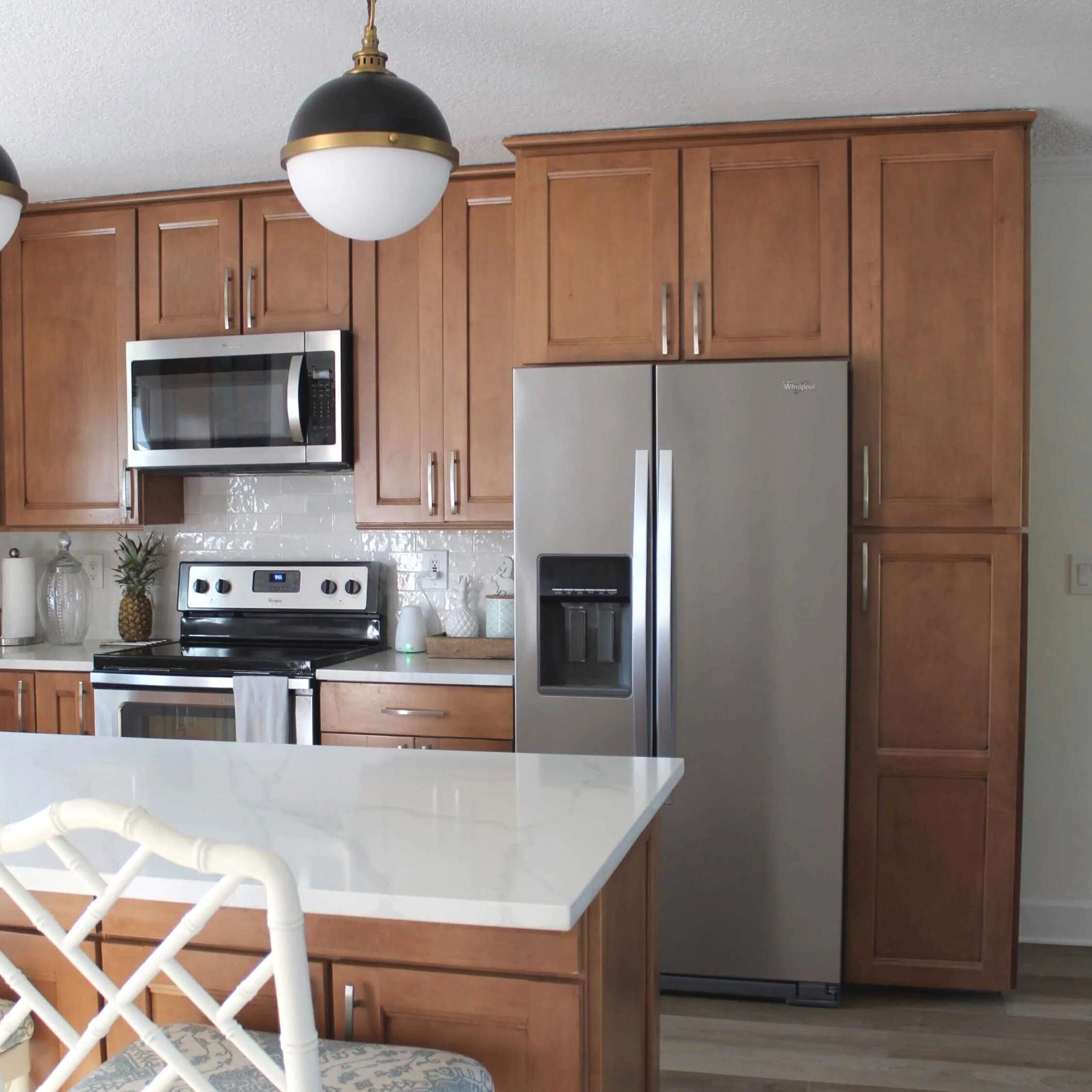
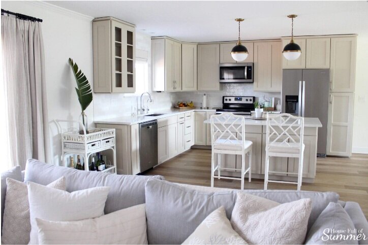
Within the hour, (and sending a million group texts to my mom and sister lol), I decided on THE color that would later be named “Jessica’s Perfect Paint Color”. :) At the paint store, I asked for just a hint of white added to Bleeker Beige and that is the the “winning” color!

Cabinet Paint Color: Customized Bleeker Beige (a slightly lighter shade)
The feeling was absolute relief when I saw how beautiful the darker and much more beige paint looked in my kitchen! It was just dark enough to make the countertops appear whiter but not so dark that my kitchen didn’t still feel bright.
I’m so glad I followed my gut feeling about that first paint color. I would not have been happy with it and it was worth scrambling to find the right color, even if it was last minute!

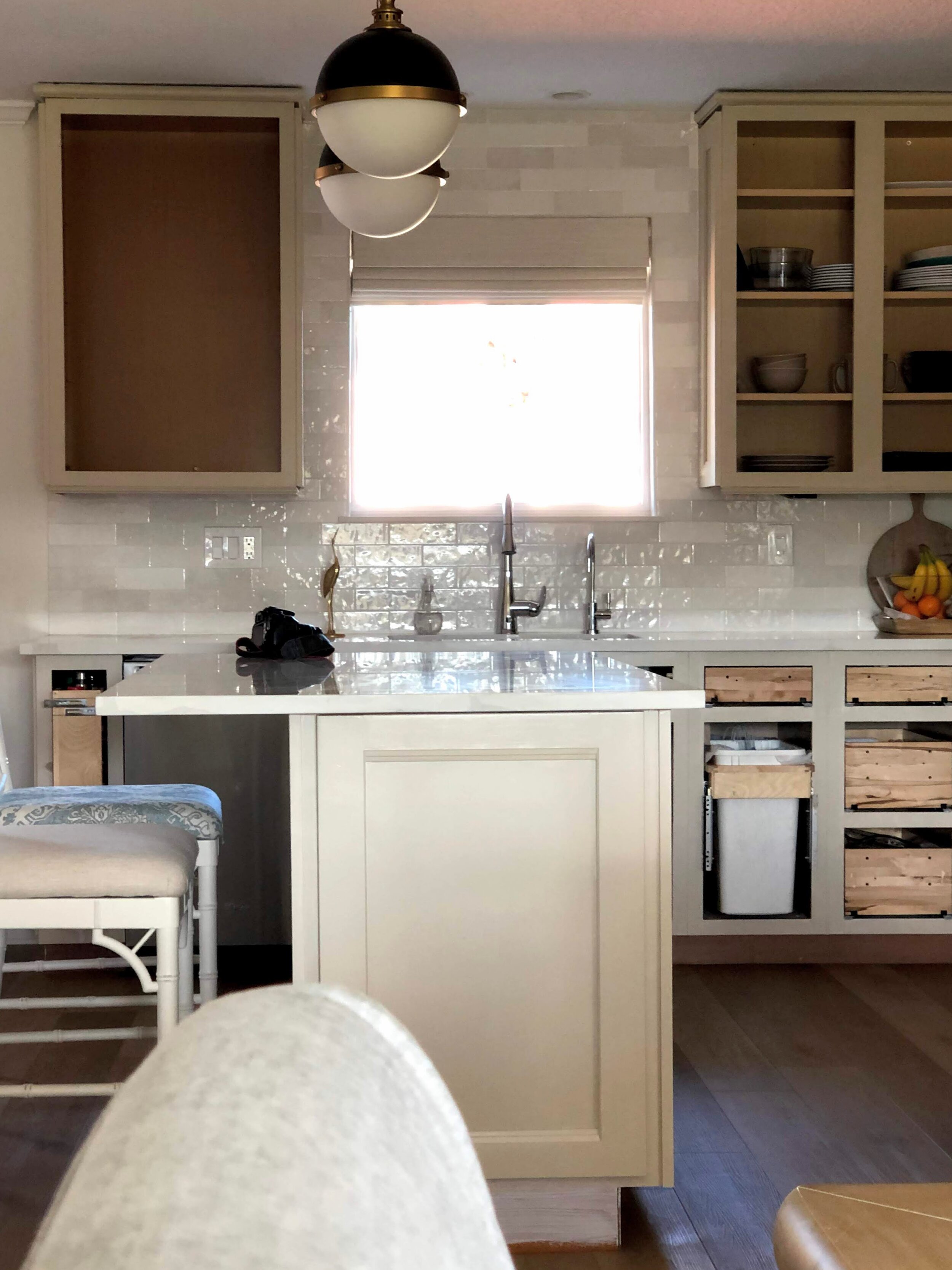
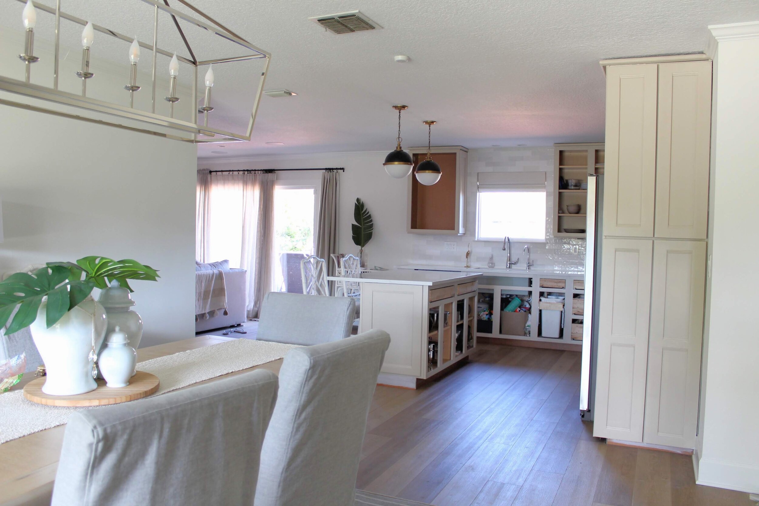
Let me remind you what our kitchen looked like before, in case you need a refresher from my last post. ;)


Here is what our kitchen looks like now!

Jennifer brought me the cutest plant and a jar for touch-up paint, should I ever need it. It is important to note that, while this paint is made for durability, it does take about four weeks to cure. It is okay to touch, but it has not reached its toughest point until a month after applying. During this time, I’ve trying to keep the AC on and limit the times where I open all the doors up to the less humid days. It’s been so beautiful outside, so that has been kind of tough for me to do! :)


What I found most impressive is that Jennifer and Sybil both free-handed all of this! No painters tape or drop cloths were used.

Our sofa is gray, and that’s just one of the reasons I knew our cabinets could not turn out gray too! I think the warm and cool tones balance each other out nicely.
These beautiful stools just might get a little sprucing up, as well. We tossed around painting them a darker color to match the pendants, but I’m going to reupholster them with a different fabric first and see if that does the trick before making a more permanent change.

Hardware still needs to be installed when it gets here, and I’m going to swap out the old glass cabinet inserts with something a little more fun and coastal! So stay tuned for a full reveal soon!
Shop This Post

Sending Sunshine,
Jessica